Case study
I must admit an equal mixture of excitement and trepidation for the rebranding of 'RATS' (Rotorua Association of Triathlon and Multisport). Their rat logo was already a local institution, and well-loved by many. While I am always excited about a new design and branding job, I recognise that there will still be some people, including the original designer who will be gutted to see their old logo disappear.
It was felt that the logo had run its course and that a lot of the club members weren't keen on competing with the rat logo on their gear, and had felt a disconnect with the brand.
This is a volunteer-led club, and any new branding would need to be signed off by the majority of the committee. I was quite prepared for a lengthy process.
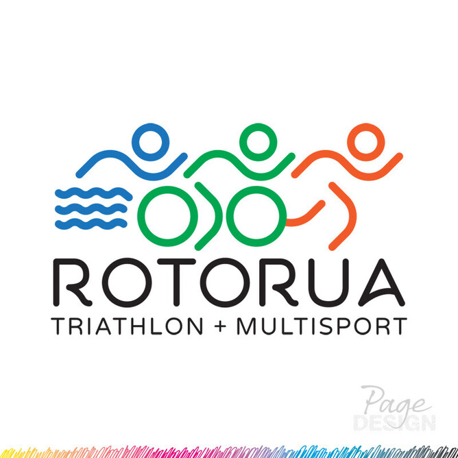
I collected other multisport logos and other sporting rat logos. I studied them, their colours, their fonts, their meanings. I looked at various simplified rat illustrations - less of a 'Looney Tunes' character, more of a simplified icon. I played around with the various multisport activities, focusing on swimming, cycling and running... Slowly I found something to connect all 3 of the disciplines - the swimming arms, the cycling arms, the running arms... I could keep those identical across the 3 codes.
I wanted to differentiate between the codes with colours, so I chose the blue of the lakes in and around Rotorua, the green of the surrounding forests and the orange for the geothermal elements in our area - reflecting more meaning into the logo.
Seperate from the icon development, I spent time with the words - it's a long name. We needed to work through a few variations of the name, whether it was to be "RATS" or "Rotorua Triathlon" or "Rotorua Association of Triathlon and Multisport" (Multisports?). There were a lot of variables to navigate through, but ultimately the committee unanimously decided to drop 'RATS" and settled on "Rotorua Triathlon + Multisport".
We considered several layouts of the words, but in the end, despite several reiterations, one of the first layouts was chosen - sometimes that is the way - we end up going full circle, testing all the options, but landing on the simplest and cleanest version.
I like to present my clients with a document and go over my thinking and my decisions so they understand what I'm showing them and why. I encourage them to spend time with the document for a while, let the designs sit with them, let themselves be drawn to one, rather than make a quick decision - this is after all a major shift away from the past, they need to be happy with the direction they're taking - all the more so for a committee.
I also like to educate my clients as to why I would suggest one thing over another. I consider how something may look embroidered, or how it would look on a building front, or possibly even a flag - depending on the company. I explain why they would need vector files over pixels - and what that means.
The logo design process was actually quite smooth - and I was very pleased to see the various logo elements being used on social media relatively quickly and correctly.
I can tell the committee is pleased with their new look - they're creating new merchandise and creating their own lovely social media images taking into account their new look.
Not everyone will love this new version of the club logo, but perhaps we can keep the old RAT logo and use that more for the children - they potentially may resonate with the character more and enjoy it. We could have fun with it, while keeping the adults with the new look.

