An overhaul for Proactive Pest Solutions
I attended a workshop over many weeks (Digital Boost) along with several other business owners trying to learn more about how best to represent one's business online. We learned many useful things and covered loads of topics, some easier to execute than others.
It was near the end of our time together that I overheard the tail-end of a conversation Rhiannon was having with others at the table about her business logo. My ears pricked up. Logos are my thing. Rhiannon and Joel couldn't quite work out what to do to make it better without losing all the recognition they already had in the marketplace. They knew the logo wasn't quite right but they couldn't work it out themselves and it seemed to me that whatever advice they were given, they had a reason to dismiss it. They went round and round and were just going to give up and leave things as they were, without any real 'stoke' around their brand.
We met up, chatted over coffee and they talked about their logo, how they did it all, what they wanted to achieve, what they wanted to keep, what they couldn't afford to change etc.
I was positive I could fix it, but I could see they were not very convinced. I'm relieved to say, that after I sent them my proposal, they agreed to let me have a go at 'fixing' it. I knew that no matter what I presented, they'd need to see my suggestions in situ, with a range of possibilities and design options.
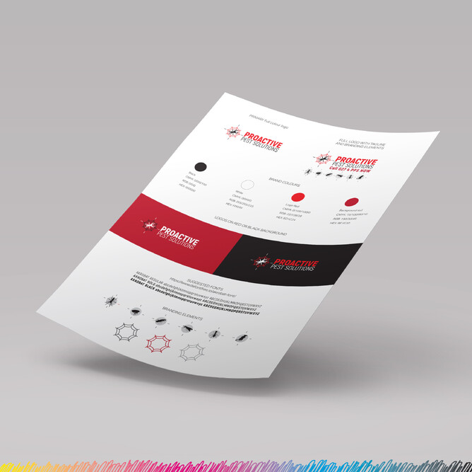
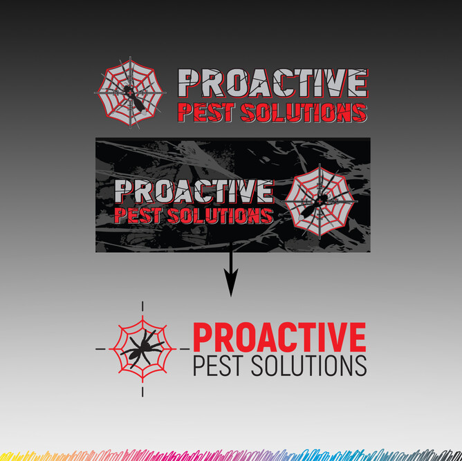
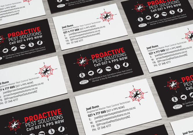
My first task was to simplify the font. Keep the feel strong - something impactful and final. No fuss. I needed to get rid of all the extra detail in so it could be read and understood even at a small size - uncluttered! Away with drop shadows, inlines, outlines, and weird web lines...!
My second task was to simplify the spider and the web.
A logo doesn't need to go into extreme detail, it needs to capture the essence of the meaning with the least amount of fuss: say as much as possible with as little as possible. Be simple and clear and easy to read both big and small. The existing spider had a white tail (white-tail spider) but having a simplified silhouette of that spider is enough - it is recognisable to those that know what one looks like and to others, being a spider is also enough. I simplified the web too and got rid of the whispy bits. In addition, there was a target in the icon which, combined with the spiderweb, and all the spider's legs overcomplicated everything. Stripped down to just 4 small lines, the target remains, but does its job with the bare minimum and doesn't get lost in the wispy web.
Rhiannon and Joel were particularly helpful in sending me all their existing branding documents (I'm pleased to say they had everything in vector format). This helped me in that I didn't need to reinvent the other 'critters' but could use what I needed to simplify and streamline further. I could reference the colours they were already using and make informed decisions because everything was at my disposal.
We had a Zoom meeting where I took them through my document, discussing their competitor's branding, what they currently have and how I envisage changing their logo. I showed them colours, fonts, different versions of their logo (with tagline, with extra critters, portrait, landscape, single colour, reverse). I showed them how, with a cleaner and more considered approach, their logo could become impactful, clear and TIDY.
Of course there were questions and concerns raised after the initial 'reveal', but in the end, after answering and advising - in detail (and qualifying my design decisions) - Joel and Rhiannon signed off on the change, with minimal fuss, and let me get on with preparing their new logo files for them.
"Thank you for reassuring us and explaining your thought process, we really do appreciate it! Please go ahead with everything 😃 We trust you and we are pretty happy, so if you are happy too – lock it in!"
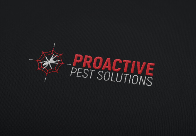
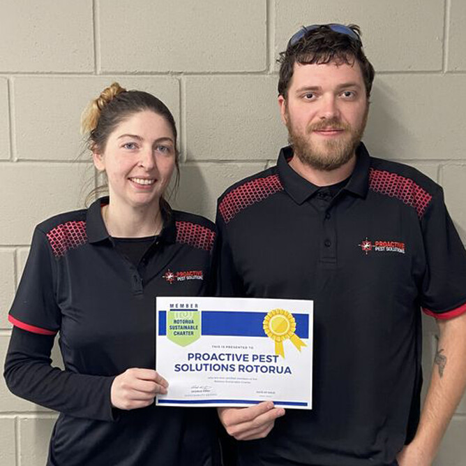
Within a week, the team were sporting new work shirts with their new, embroidered logo and within 2 weeks they had new business cards delivered to their address. Designs are in progress for a new vehicle wrap to complete the printed changeover.
I have to thank Rhiannon for all her lovely reviews and recommendations I keep finding on social media and Google, it's great to have changed their attitude to their business by bringing back their STOKE.