Attention to detail
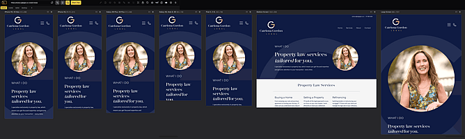
Unlike designing for print (where things stay where you put them!) a website is able to be viewed on a vast array of different-sized screens, from extra-large monitors to mobile phones of all shapes and sizes.
It's important your web designer has spent time on your website design to ensure that whoever is looking at your website has a good experience - all the information should be visible, not too small, not too big and the order that things appear in should be relevant to the user (not in a haphazard order).
Something as small as the margin (the space between the side of the device and the information on your website) can make a big difference to the user experience. Having a little breathing space takes away stress, making sure text is big enough to be read with ease, that busy backgrounds are switched off for phones - there are so many small decisions that make a big impact and reduce eye-strain.
A responsive website ensures automatic morphing to the user's hardware, with all the information visible in a logical and pleasing arrangement.

